The best way everyone can start an online business is to learn the best practices without re-inventing a wheel. But often the reality is that businesspeople make tons of changes to find the best working combination for their case. These experiments include attempts to find the best traffic, design, value propositions, price and so on.
Our today’s guide includes the ultimate list of conversion rates optimization, best practices you should try in your business practice. These methods are called “best” for a reason. They work for the majority. But you should also remember that different businesses have their particular qualities, so be careful and analyze every of listed tips applying to the specifics of your business.
If you have some thoughts to add to this list, please let us know! We’ll edit our text and add your recommendations in this case.
- Keep your landing pages simple & uncluttered. Remember – everything that may distract or confuse your visitor WILL distract him on practice. So, try to remove all the unnecessary elements and to direct the focus of your visitors only on the desirable actions on your website.
- Add a trust factor. To this point, we can relegate such site elements as customer testimonials, rewards, and links to your social networks.
- Make sure to A/B test different versions of your pages and copies continuously, using our easy to implement tool Maxymizely (learn more about our features and advantages under the link).
- Reduce the fields in your forms. Remember an easy rule: the fewer form fields you add to the form the more leads you get.
- There is no good idea in automatic image sliders. The numerous studies say that image sliders kill conversion at websites. The reasons are the banners cause banners blindness, divide user’s attention, they’re hard to get clicked, and so on.
- Don’t use weak stock photos. It’s much better to take a picture of a real person working in your company. It will be certainly better than something like this 🙂

- Don’t think about visitors like they’re fools. Show them the real face of your business. It will help people relate better and make them willing to do business with you.
- Test Your Call-to-action Button Text. Do you know that CTA text may effectually change the conversion on a webpage? You should try to A/B test different variations. Numerous case studies at Whichtestwon.com show the differences between conversion rates using different Call-to-actions.
- Place your CTA above-the-fold. Another conversion killer is just… the absence of CTA buttons above the fold, namely on the first screen of the website. Don’t make such a mistake! Simply add CTA buttons to the first screen and you’ll be surprised with the results of changes in conversion rates at your website!
- Make Sure You Have a Clear Headline. Examine your headlines – are they capacious and catchy? How do you think, do visitors understand the core idea of your written thought? Is it clear and short?
- Create Urgency. As much as we’d like to believe otherwise, the majority of us are procrastinators. We leave things until the last minute. Then we rationalize. We say that we need time to make a decision. What this really means is we haven’t been convinced to act now, so we wait. Here listed the different ways you can use urgency factor on your landing page.
- Display Your Contacts in the Visible Spot. For people turning to you is important to know they can ask you questions and contact you in any convenient way. So add some trust to your website and make it handy to appeal to you.
- Change Your CTA Link into a Button. The button is simply more noticeable for visitors.
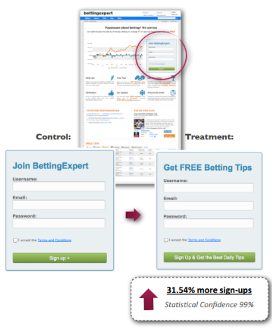
- Use the Magical Word “FREE”. Be sure to try it, if you haven’t already. It won’t take more than 2 minutes to create such a test in Maxymizely. And of course you don’t need a designer or HTML knowledge for that.

- Add Testimonials. The best testimonials are those underline your value proposition and the benefits of your product or service. The best testimonials are the ones from opinion leaders in your niche.
- Show Off Your Trust and Award Badges to strengthen trust to your company. The best practices of CRO with a help of Award Badges are listed here.
- Figure Out Your Value Proposition. It’s the first question you should care about while starting a business. What differs you from your competitors? Why should people prefer you instead of other tons of companies? Answer this question firstly to yourself and then to your prospects.
- Add Security Seals. Despite the high price of security seals they will justify each coin you spent. Customers want to be sure their money will be safe and they will get what they pay for.
- Use Relevant Images. Every image on a website is aimed to reach a specific goal connected to a sales funnel. If you’re using images just for fun or to fill the empty areas you’re not doing it the right way.
- Test Everything. Start with something simple and test particular elements (whether it’s an ad, landing page, email, etc). Test everything and never stop testing.
- Tell a Story Customers Care About. Instead of telling them why you’re awesome, say how they will become excellent with your product or service.
- Make a USP/Value Proposition Easy to See. Remember that the brain forms the image of a business/product in the first 3-5 seconds. If your prospect doesn’t find the needful information about your business within these seconds, he’ll leave.
- Build a Benefits List Instead of Features. Define what are your consumers getting out of your product/service. What is their profit? Care more about people’s needs, not about yourself.
- Use Landing Page Design Techniques such as choosing contrasting colors, embracing white space, adding visual cues, CTA encapsulation, etc.
- Talk To The Relevant Audience. Confirm that you’re communicating to the right audience. At Maxymizely, we have a great analytics tool named 3D Quality Cube, which helps to define the quality of website audience across three chosen metrics.
- Define Personas of Your Customers. It will help you to make right marketing decisions. The helpful guide with everything you should know about buying personas is under the link at Bufferapp Blog.
- Choose Clearness Instead of Complicated Creativeness. It’s always better to choose pure and plain essences, because they’re better to perceive.
- Less Frictions = More Conversions. Try to reduce the number of steps for your prospects to reach the last step of your sales funnel. Every additional step may cause an interruption of the decision-making process of your audience. The less steps your prospect needs to make, the more likely he or she will perform the desired action.
- One Main Idea Per One Landing Page. Don’t ever overload your landings with different CTAs. You should consider using one landing page per one user’s action. If you add too many messages, your visitor will lose the main idea and will hardly perform the desired action.
- Use Psychological Principles of Sales. These principles are instant gratification, reciprocity and loss aversion.
- Instant Gratification. Research has shown that instant gratification is such a powerful force that only powerful natures can push against it. If you can give something to your customer that your competitor can’t with all other things being equal, you win.
- The Power of Reciprocity. In social psychology reciprocity means responding to a positive action with another positive action, rewarding kind actions. Try to combine the power of reciprocity with instant gratification to get unpredictable high results in your conversion rates.
- People Prefer To Avoid Losses Than To Acquire Gains. Psychological studies declare that first principle of losses is twice as powerful as second, gains.
And the last advice (but not the least). Don’t Rely On Intuition And Even On Best Practices :). Test whether your optimization efforts work good for your own case!

