
CRO has never been easier. There are tons of articles around the web helping to get all the desired information about principles of A/B testing and conversion rates optimization, web users behavior, persuasion principles, and all other moments helping to growth hack your business via internal conversion rate optimization techniques.
In this article, we’ll show the compilation of the most amazing conversion optimization experiments with their results that will be interesting to consider for all the online marketing practitioners in the field of CRO marketing.
God bless Conversion Rates Optimization! 🙂
-
How to make $1 million using landing page optimization and email marketing or SEOmoz/Moz large landing page case study
- Updating of the landing page – 54% increase of conversions
- Prepating and promoting via email channel of a quick-start guide – 116% increase
Despite the widespread thought that large landing page converts worse, Moz proved the opposite state in their case study, published at www.conversion-rate-experts.com at the times when Moz was called SEOMoz. Nevertheless, the techniques described in this case study are still relevant. After the series of surveys, asking different groups of visitors (paying members, non-paying members, members who canceled their account, etc.) a more considered and effective landing page was designed. Firstly, the landing page has become longer to accurately describe all the capabilities of the service pushing to buy their leads. Despite the common myth telling that short landing pages convert better, the results of such the improvements confirm the opposite.
The updated landing page achieved the 52% improvement! The further work was focused on the offer. The survey www.conversion-rates-experts.com found that people didn’t want to buy the subscription even for $1 only for one reason – they were afraid there were also some hidden fees or the subscription was obligable for a few months. So, the company predicted that problem and developed a retention strategy aimed for new subscribers (qualified leads) to get them impressed for 1 month. The experts created a quick-start guide so customers could get quick wins.
Thanking the series of improvements SEOMoz achieved a conversion increase of around 170% over 4 months and earned $1 million more comparing to the period before A/B testing.
-
How Crazy Egg increased conversion rate by 363%
- Redesign of a landing page (making it longer) – 30% increase of converting to leads
- Adding a video to a landing page – 64% conversions increase
- Renewing of the checkout page (lead generating) – +116% to signups
The only aim of any lead generating a landing or website is to bring enough prospects to business. Of course, in some cases it’s important to add videos, great content or educating materials to reach this goal, but not in this case study! 🙂
After the research, the company decided not to reduce a landing page, but to extend it! And the redesigned page became about 20 times longer than the control. Here is the renewed page:
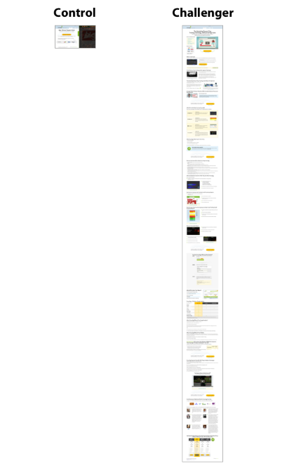
The results were that a new page outperformed the control by 30%. But the company didn’t stop and decided to continue testing, for this time it was the testing of different media. The point is that people have different learning styles. Though the written word is still the most widespread medium on the Web, it’s also important to appeal to people who prefer learning by watching. So, what was the result? Even though the video message was pretty similar to that of the rest of the page, during the split-test the version of the page with the video on it generated 64% more conversions than the control!
The further story of these improvements relates to a one-time offer and how it helped to increase the lifetime customer value. An effective way of increasing the value of the customer is to incentivize customers to commit for a longer period, by offering a discount.
The decision was to create a one-time offer to the customers who recently signed up for any level of non-trial, paid service. Conversion Rates Experts have shown the following offer to all the existing customers:
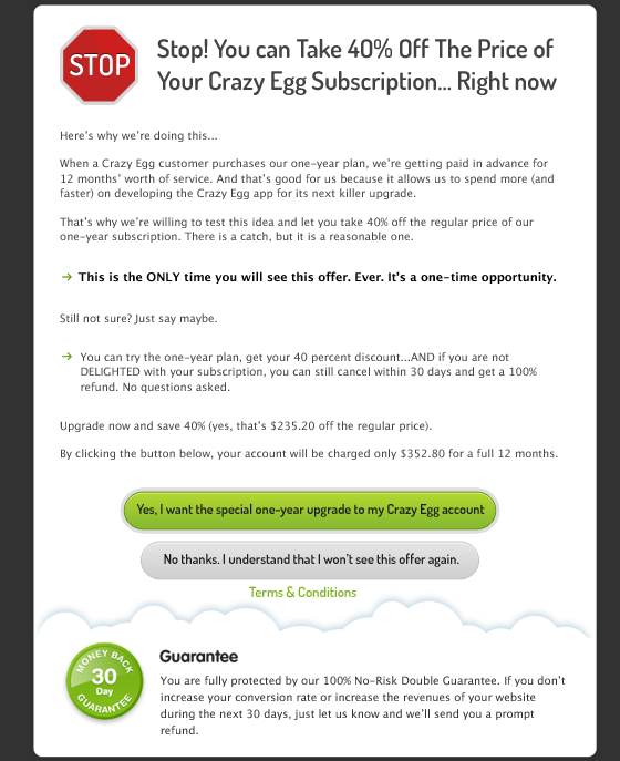
25% of all customers accepted this new offer! Because it was effective, CrazyEgg also embedded it into the checkout process, so it was shown once to each new customer.
When calculating the revenue effect of implementing this offer, the team factored in the lost revenue from having some customers take the offer and therefore not paying the higher fees associated with a month-to-month plan. After taking that into account, this one-time offer still considerably increased the company’s annual revenue.
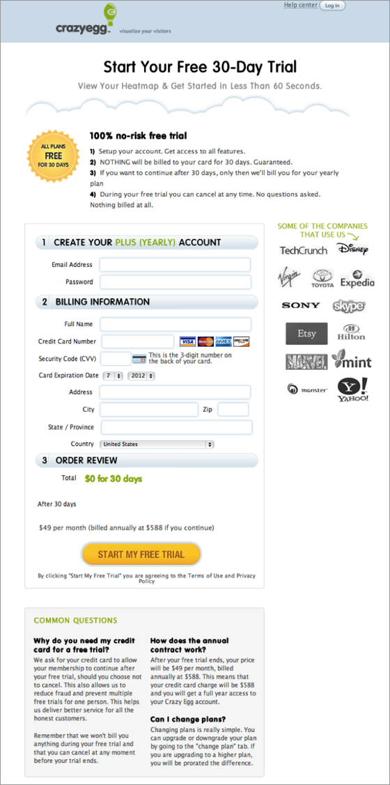
The next and the last step of these huge improvements was changing the checkout page, where visitors should have signed-up for a free trial. The team installed Qualaroo (the survey tool) on the page where visitors could sign up for a free trial to understand what was on minds of their visitors there. And they discovered that the visitors didn’t like having to put in a credit-card number for a free trial because they thought it was dangerous and looked like a scam. In order to convince them of the opposite, the team of CRO professionals put an explanation box next to the CTA button, explaining the need to get card details (it only prevents users to register multiple trials).
How do you think what were the KPIs of the renewed page? The results on this stage were +116% of signups and the full increase of conversion rate during the optimization process reached 363%!
Source: http://www.conversion-rate-experts.com/crazy-egg-case-study/
-
How a Charitable Organization GOCC (The Great Orchestra of Christmas Charity) Got 420% Conversion Rate Improvement!
- Changing of the menu structure to a more user-friendly manner
- Replacing the text at the banner (‘Pay online’ instead of ‘Support’)
The Great Orchestra of Christmas Charity (GOCC) is a big non-governmental charity working in Europe on raising money for buying the costly medical equipment.
As you have probably already guessed, the online method of making the donations is represented on the website too. Let’s look at the way the successful improvement was implemented and brought to this fund appx. 420% rise.
In 2014 the sum of all the online donations (via the website) put together $300,000. But the year before the total amount was only $70,000 with almost the same number of visitors.
The watched conversion increase was caused through implementing changes based on the following findings.
The hypothesis behind the tests was that it was hard to find the online donation options on the website, as they were not prominently featured on the main page. This hypothesis was confirmed by the majority of the respondents – only 44% of them found the online donations subpage!
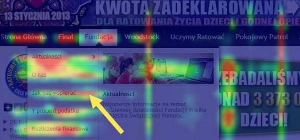
- Firstly, the company changed the page placement in the menu structure. It became the second label from the top, which made it much more visible. The textual content on the online donations page was replaced with clickable graphics that describes different methods of payment in a friendly manner:
Another assumption was that people seemed to ignore a banner on the main page with the title “Support” on it. People from the Great Orchestra decided to go with a more clear phrase “Pay Online”. The new banner with a direct copy attributed for many donations during the Grand Finale. Because of its success, the GOCC decided to keep the banner online and by this day people are donating money to this great cause.
The conversion rates optimization results: In 2014, after finishing these improvements, the GOCC gathered almost $300,000 via their website, which is a 420% conversion rate increase comparing to the last year.
Source: http://blog.usabilitytools.com/great-orchestra-christmas-charity-420-conversion-rate-increase/
-
How Voices.com Improved Conversions by 400%!
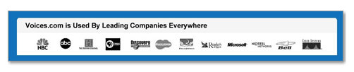
- Adding the trust symbols from the companies who used Voices.com in the past
- Segmentation of the traffic based on the user’s type
- Creating explaining videos for the pages that caused confusion
I like this study for the fact that these people managed to successfully create a single site for multiple audiences with different intents. And in fact, www.conversion-rates-experts.com they have done incredible improvements that brought to 400% of business growth! The first step was researching as it should have been. 4 major areas were researched before designing their conversion experiments:
- Analytics (to find the pages with the most problems/opportunities)
- Visitor polls (to understand the “non-subscriber” mindset)
- Sales literature and interviewing the company’s CEO (to find everything that would impress prospects)
- Competitors’ websites (to exploit their weaknesses)
After getting all of this knowledge Conversion Rate Experts launched the series of A/B testing experiments that targeted 5 different areas of the sales funnel.
A common problem for both voice-over artists & companies is that the average websites from the niche exist only to collect advertising fees but don’t deliver quality, talent, or jobs. To combat this, one of the “quick wins” the team implemented was the use of trust symbols from the companies who used Voices.com in the past.
They also segmented their traffic based on the visitor’s type:

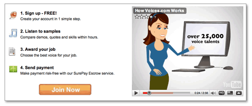
They created “explainer videos” for pages that normally caused confusion:
These were the key contributors to an incredible improvement, and for a huge reason: As you go deeper into the site, every question is answered at the top of the page, making you feel “safe” during every step of the process. All the improvements at this website caused the huge 400% uplift in conversions!
Source: http://www.conversion-rate-experts.com/voices-case-study/
-
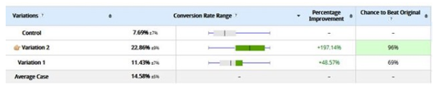
How SuperOffice boosted sign-ups by 197%
- Landing page optimization (deleting the trust symbols, testimonials and logos)
- Creating the extended version of a homepage (the landing page)
- Adding the explaining video
- Adding the special offer
- Optimizing a checkout page
There are a lot of different channels that may help your potential buyer to contact your business. The list includes but isn’t limited to the phone, email, live chat, etc. One of the best methods to make it comfortable for visitors to contact you is to add a handy contact form to your website.
The case study of SuperOffice is about increasing the number of leads through their landing page, where there was a possibility to schedule a demo version of the service. This way allows contacting the lead directly by phone after filling up the form.
As we know, best practices show that websites should use social proofing in order to establish trust. SuperOffice used this best practice to create a variation of the sign-up page, which included brand logos and testimonials on the right-hand side of the sign-up form (the middle image). Another variation was created without any distracting elements to focus users’ attention only on the web form fields (the image on the right).
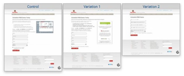
The result was that both test variations performed better than the control version but the second variation (without any social proofs and other disrupting elements) got a 197% increase in completed signups for the free demo page.
But it wasn’t all! Further optimization resulted in a total of 363% more sign ups. Thanking conversion rate optimizers the page became 20 times longer than the original Home page. It shows that their visitors were keen to learn more about the product and have their questions answered before signing up.
The use of video, special offer, and an optimized checkout helped to increase signups even more. Some believe that a shorter page would prevent user drop off and encourage sign ups. However, for certain products, it’s important to explain the product in detail, offer answers to questions and assurances to help conversions.
Source: http://www.searchenginepeople.com/blog/5-conversion-rate-optimization-case-studies.html
Actionable A/B Testing Advice
- Go to your website’s homepage and ask yourself if the next thing you want your visitor to do is clear.
- Ask yourself if it’s obvious what your business offers and how it can help to visitors from the key pages.
- At every point in the process, you should provide confirmation that your visitor makes right decisions.
- Build and analyze the conversion funnel for your website (by the way, there is a handy option in Maxymizely, you can read our guide on how to discover website areas you should improve via A/B testing)
- There is no such thing as too much attention to detail when it comes to making people feel comfortable, so keep testing incessantly with Maxymizely.com!