The most annoying cause of a lack of conversions on a website is when you are getting tons of costly traffic without a return on your investments. Offensively and disappointing for any business owner! And for your visitors, it’s like slamming the door on them. They went to your website and couldn’t meet their needs there.
While the purpose of any online business is getting profit by attracting proper visitors to a website and converting them, it’s not likely to happen if they stumble over a bunch of conversion killers on the site. Among the reasons of this can be everything from slow load times to poor website design.
Don’t give your visitors any reasons to leave your site! Here are the most common conversion killers and how to fix them.
- Unprofessional website design. It’s traditionally the first and the most common issue among beginners in landing page building. The problems with this point will occur in the following cases:
- If you’re using image sliders on a home page. If you still have an image slider or a carousel on your website, remove it immediately! I’m not alone with this thought. Here is also the article of Peep Laja on the theme, another one at the Instapage’s blog, and so on.
- There is visual noise at landing. When there are too many visual elements that produce visual noise for your visitors. It may be a large number of colours, website elements, unstructured text or blocks, and so on.
- A lack of proof or obscure trust seals. Your visitors want to know you won’t cheat them. Trust and security seals can help put a potential customer’ mind at ease, knowing that you protect well his or her personal information. Let me give you an example. Buyakilt tested two security seals. They started with the “Norton by Verisign” seal for five weeks. They increased conversion by 17%. Next; they tested the Comodo seal and conversions increased even further by an additional 12.49%. Adding the two results, the overall increase in conversion rate was 31.6%, which translated to a six-figure increase in revenue!

- No CTAs. If you have no CTAs on your website you should know you won’t have success in online conversions. So, take it as a note!
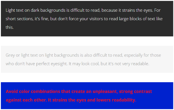
- Poor choice of colours or contrast which makes your readers hard to read.

- Checkout at a different domain (shared SSL checkout process). If you’re using checkout at a different domain in your business, it can be annoying for users and make them not trust your business. Use secure https protocol for payment pages or whole site.
- Slow load time. Yes, speed is one of the top factors that can drastically increase conversions on a website. The majority of users expect a website to load its pages in 3 seconds and less. You can always inspect your pages speed using Page Speed Online, as an example of a fitting tool.
- Too many barriers to perform a valuable action. At this point, we can include everything that can abuse conversions because of a number of steps to perform useful actions (such as like checkout or lead generating).
- Extra taxes and shipping charges. Another bad practice to use, for sure. If you got an unpleasant surprise at the end of your sales funnel for your visitors, they could be very alike to abandon their cart. So, don’t be too tricky, honesty is always a price!
- Having a weak copy. A poor copy is one that doesn’t encourage readers to leave their emails, to buy or perform other valuable actions.
- Not using landing pages. The main reason for this is that targeted promotion or product specific landing pages are focused on a single objective that matches the intent of the ad that your visitors clicked on to reach your page. If you consider the example of sending traffic to your website vs. a standalone landing page, you can understand that your homepage is designed with a more general purpose in mind. It speaks more to your overall brand and corporate values and is typically loaded with links and navigation to other areas of your site.
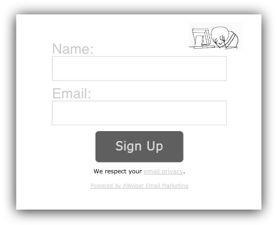
- Using low-converting locations for the lead magnets and CTAs. A lot of people place their opt-in form to the website somewhere in the right column or other hidden place, and then they just forget about their lead magnet. Don’t make such a mistake! Your first goal on the website is to stream traffic there and the second one is to engage your users and, ideally, to grab their e-mails after that. And remember such pop-ups don’t work, too 🙂

- Unbelievable customer testimonials (plain text, stock photos, abbreviated names, etc.). It’s better to use your face rather than to photoshop images coming up with responses.

- Too many CTAs at a page. It may happen in a case when you have a few conversion goals on the same page. It’s quite a common mistake of the beginners in landing page building. In such a case your website’s visitors will be confused and won’t perform the desired actions. The only solution is to leave the only goal per one web page.
- Round Numbers. Don’t use round numbers on your website, because they are not trustable. If you want to offer your visitor to join 10000 subscribers, think twice. This figure doesn’t look honestly. It’s better to take, for example, 13525 subscribers that will create more trust.
- Forgetting about the mobile users. Look at the numbers: the estimated volume of Mobile E-commerce in 2018 is $626 billion! So, if you have no adaptive design at the moment – do it as soon as possible! View more mobile marketing statistics to go without any doubts at SmartInsigts.
The web continues to evolve every day, so it’s no wonder you may be using a few outdated practices that are hurting your conversions. The more we learn and test, the more we understand about what motivates customers to buy, or to flee. By removing these common elements, and replacing them with the recommended fixes, you will be on your way to earning more trust and engagement with your prospects, resulting in a very healthy increase in your conversion rates.
Enjoy incredible A/B testing and web analytics possibilities of Maxymizely! Don’t let your site waste your money!

