Your landing page is the key factor in lead generating. And the essential part of the landing page is an opt-in form on it. If you want your visitors not to fall off without converting, you should improve your opt-in form step by step until it’ll reach suitable for your business performance.
Here are 5 A/B tests (and some bonus ideas) you should be running on your landing page opt-in forms to be sure that they’re well-optimized for conversions.
- The position of the opt-in forms on the page
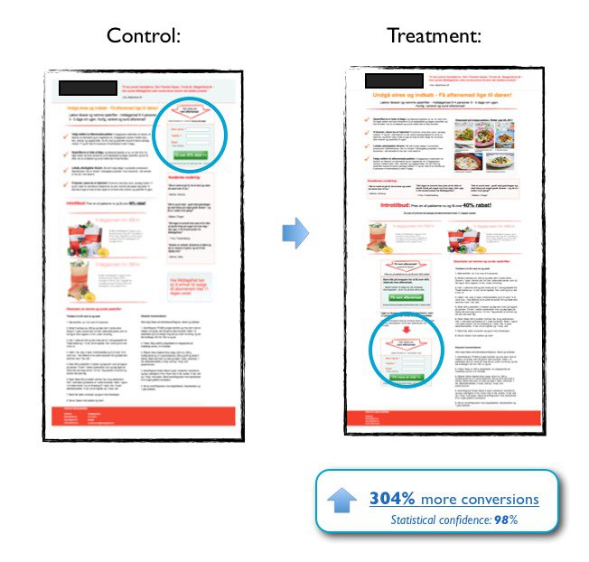
The first and the main thing you must remember is placing your form above the fold on the page. Numerous cases and studies prove that placing CTAs below the line drastically reduce conversion rates. Nevertheless, there are also cases when placing CTA below the fold can help to gain more leads. E.g. in this case study prepared by ContentVerve we can see how placing the form below the fold caused 304% growth of conversion rate.
- Caption alignment
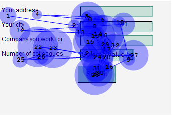
The alignment of the captions in the opt-in form will influence not only the design of the form but also its performance. The eye-tracking study of Matteo Penzo shows how different alignments can affect the perception of information represented in the form.
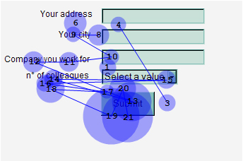
The winner variation is:
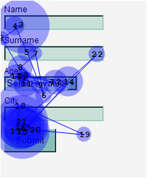
This study shows how many “eye fixations” does it take to get information from each alignment and the conclusion is the third variation with the labels above input fields is the best variant to perceive, because the eye does not need to jump from the text in the field to understand what is required in the form. So the form is easy to understand and more people will complete it.
Anyway, you should remember the main rule of the smart online marketer – first test and then make right decisions based on your test.
- Personalize your CTA copy
It’s not a secret that improving a copy of any significant part of the site on the buyer’s journey including opt-in forms may greatly increase conversion rates.
As an example, in a case study from Unbounce.com a CRO expert made an assumption that getting personalized will increase conversions of the form. This hypothesis worked and the A/B test variation got 90% more conversions than the original.
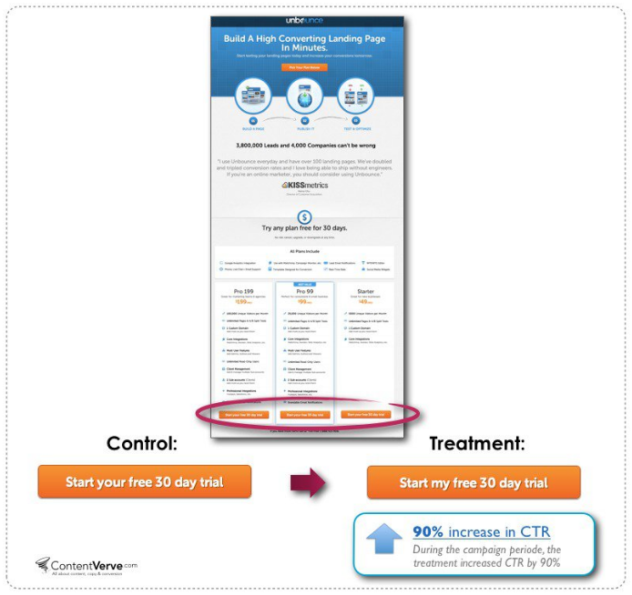
So, try to appeal in a more personal way to your prospects to get a better response. As copywriter Joanna Wiebe accurately describes in her article, your copy should complete the sentence: “I want to _______.”
- Test the privacy option
Oftentimes marketers think that adding copy about privacy will add trust to a company. But as it turns out it doesn’t always work. Look at this experiment from Contentverve.com.
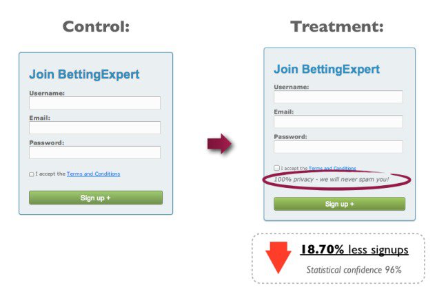
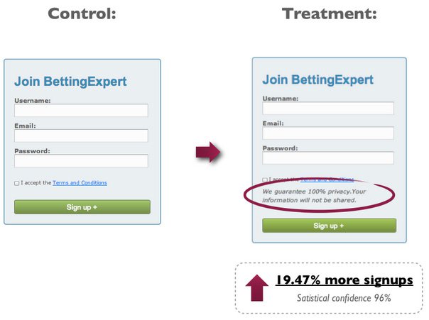
The text ‘100 % privacy – we will never spam you’ caused the decrease in conversions to signups from the form by 18,7%. The hypothesis was the word ‘spam’ associated with negative connotations that became the cause of conversion performance worsening. Then the team of Content Verve launched another test with another text copy about privacy. The text in the second test was ‘We guarantee 100% privacy. Your information will not be shared.’ The second variation got +19,47% to signups. So, security matters but the copy matters firstly.
- Test the length of your form.
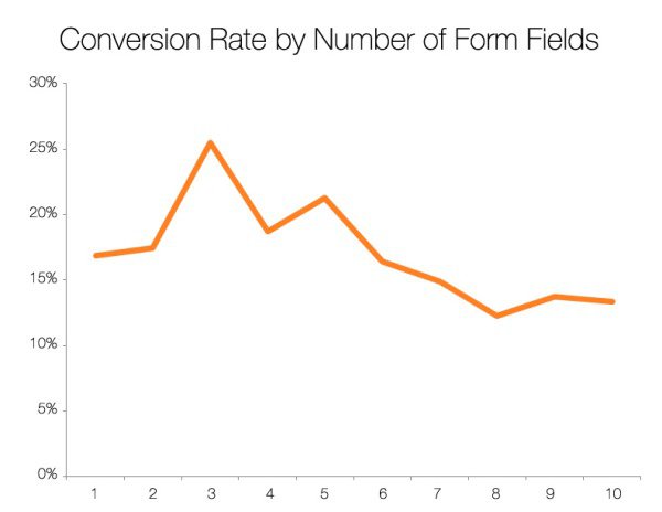
The key is not to place unnecessary form fields because longer forms convert worse. Look at this chart describing relation between number of fields and average conversion rate of the opt-in form and make the conclusions:
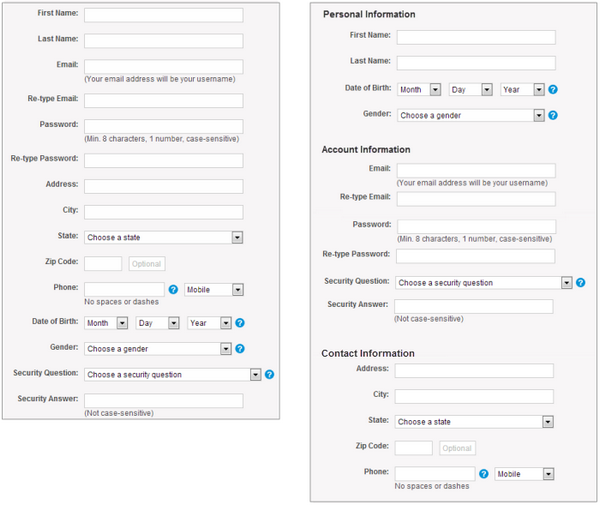
In case you need to get a lot of data from your prospects to satisfy your sales team, you should structure your opt-in form in the cluster blocks as it’s shown in the example:
You should remember if the opt-in form looks like it’ll take me more than 10 seconds to complete, a lot of your prospects will put off. And your competitors are always only a click away.
And here are some bonus ideas to test on your opt-in forms:
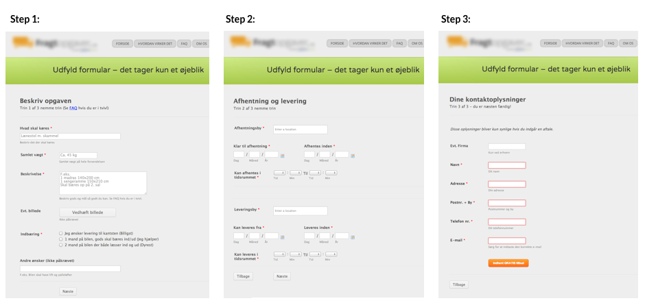
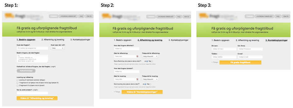
- Reduce the number of steps to complete the form. The truth is people don’t like long web forms. So, if you need to get a lot of info at once, try to make your form easy to perceive and try to reduce the number of steps for your prospect or at least simplify them. The case of simplifying the 3-steps opt-in form is described in the article at Content Verve.
This is how the form looked like before changes:
Its view after changes and A/B testing which showed 30% lift in conversions of the form:
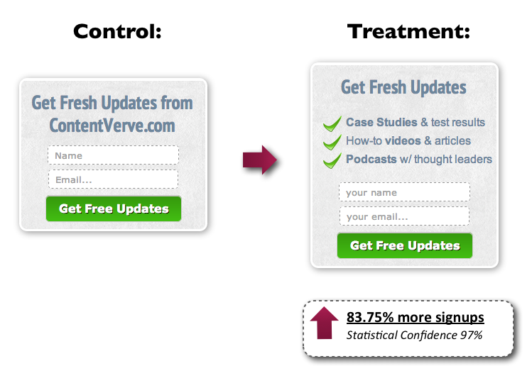
- Give your visitors a worthy reason to subscribe. Clearly and concisely detail the benefits of subscribing. Use bullet points, bold text, and other techniques to tell your prospects why they’re going to be better off getting your proposal.
The morality of these tests is that you should test your hypothesis even if best practices show you certain results, cause the results will be different for different audiences, niches, time and conditions. So, keep A/B testing with Maxymizely.com! 🙂
