
There is no secret, that the checkout rate is the cornerstone for any e-commerce business. Let’s discuss the most widespread reasons of shopping cart abandons to find the actionable conversion optimization solutions.
Let’s start with defining what is the shopping cart abandonment generally. It is the situation when online visitors choose and put some items to their online shopping carts, but then leave before completing the purchase — the bane of the online retail industry.
According to Baymard Institute, at least 67,45% of all carts are abandoned. And everyone does it. You’re surfing different web pages to find something you need to buy. Finally, you make your choice, add an item to the basket, start to fill out shipping information, billing… payment information… But something happens, you close the window or just lay your phone on the table with an unpaid item in a virtual shopping cart, waiting for your comeback. And this is such a sad story every retailer may tell. Let’s look through the most common causes of shopping carts abandonment.
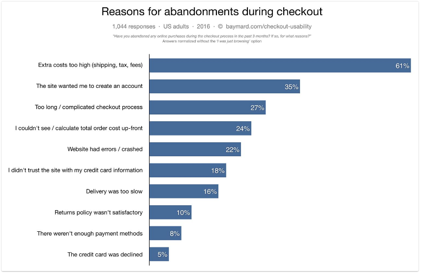
Of course, there is always a segment of users who’re just surfing around the web without a certain intent to buy. That’s why this chart is showing all the cart abandoners after the filtering out the segment of ‘web-surfers’. And the remaining part of users that was displayed on this graph can be returned with some marketing or design enhancements. At least, you should always try to return them. What are the main possibilities for every digital marketing specialist after seeing this wonderful chart? Here is a short and extremely effective list of actionable advice to boost your checkout conversion rates.
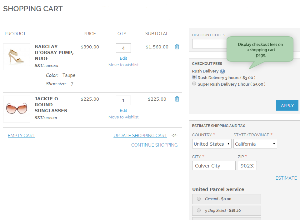
Play up with free shipping and make extra charges transparent
The statistic says that the majority of people abandons their shopping carts because of unexpected extra costs. It’s 61% of all users. So, make your best to offer your customers free shipping and let your visitors see all the additional charges at the beginning of their checkout funnel. If you cannot remove such graphs of costs, according to the specifics of your business, it’s always better to exclude the users who’re not ready to pay these charges at the beginning, than to haul them until they escape at the end. This will greatly facilitate and improve your remarketing later.
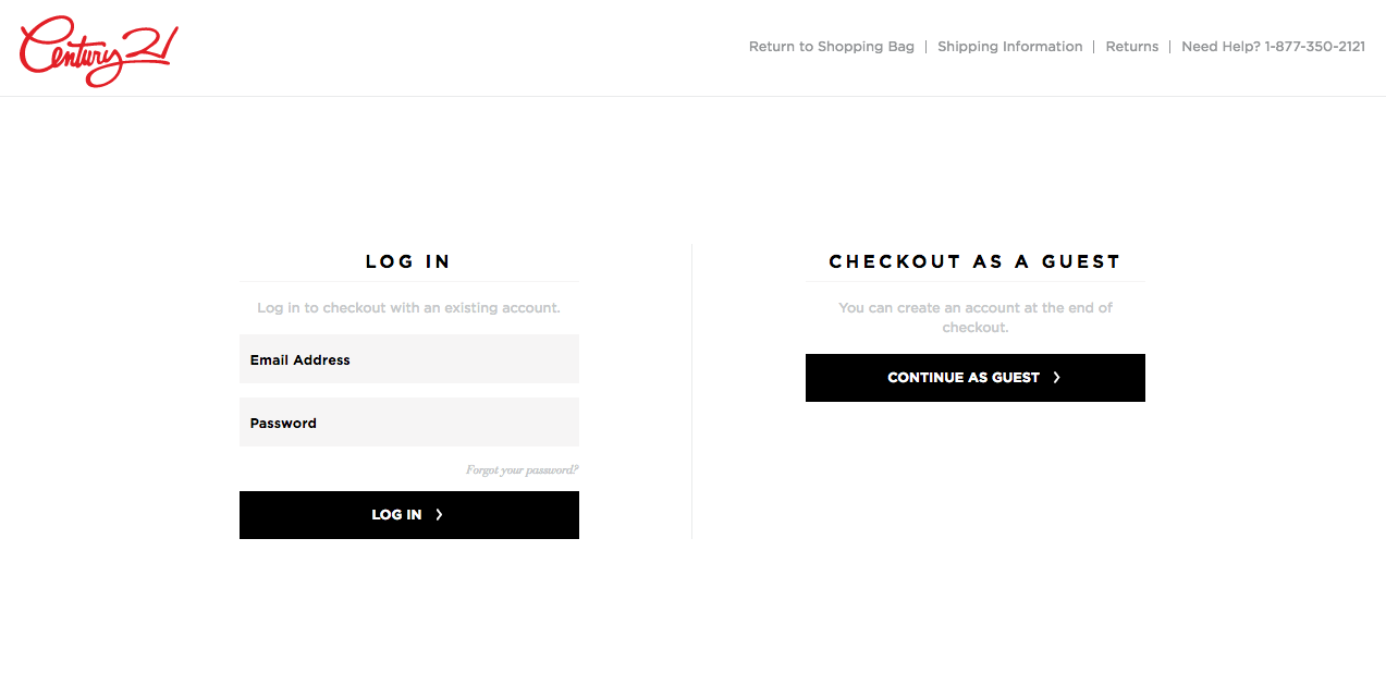
Skip mandatory sign-up
The statistic says that 35% of users will abandon their shopping cart if there is an obligatory sign-up in a store. The widespread issue among customers is the fear of commitment when it comes to purchasing online. People don’t like to bound themselves with some obligations while making common purchases on web stores. That’s why it’s a wise decision to make the sign-up as the optional step on the final stage. It allows capturing the both types of customers, including those who don’t want to sign up at your store claiming the long-time relationships with your brand.
Make your checkout form easy to use
The statistic says that 27% of all researched users abandon their carts because of a too complicated or too long checkout process. So, you can always take the following steps:
- An experiment with a one-page checkout. It’s a really good idea to A/B test an easy-to-fill all-in-one checkout page. Nicely for ecommerce stores, because every additional page during the checkout process creates an additional opportunity for a shopper to abandon the checkout process. Including all checkout information and fields on one page simplifies and shortens the checkout process which should lead to a higher conversion rate.
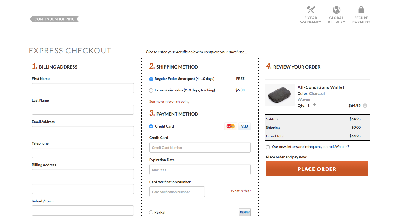
- Remove all the unnecessary fields. The second advice you should A/B test is removing all the non-necessary fields. It’ll be also great to start researching your form field performance with the help of such tools as Formisimo or HotJar. By these means you’ll get the knowledge what complicates the checkout process most and will be able to get rid of these weaknesses.
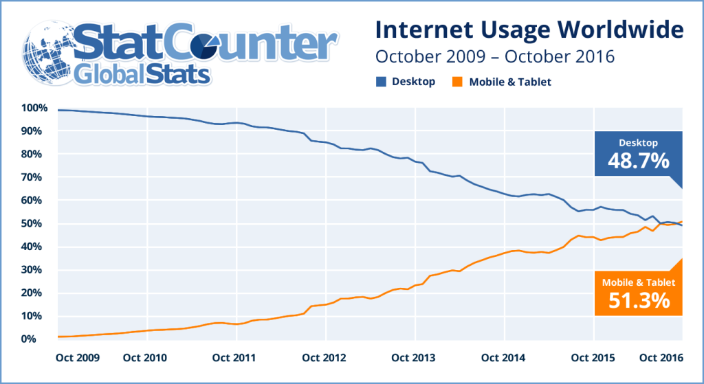
- Use Mobile-First Design. Passed those days, when mobile friendliness was just desirable. Now it’s a No.1 priority, because in October 2016 the significant event happened, the number of mobile & tablet devices began to exceed the number of desktop devices.
Implement a secure payment gateway
The next significant graph on the Baynard Institute’s chart is the lack of trust to give credit card information. It causes the 18% of the total declines.
There are a couple of ways to improve this weak point.
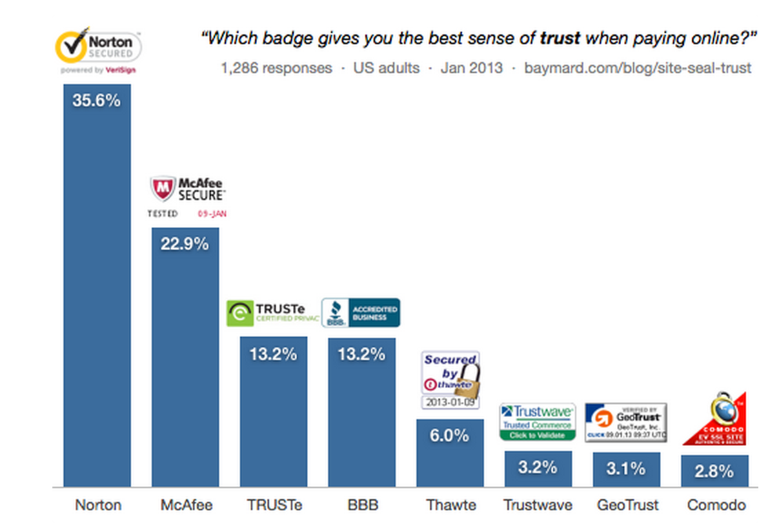
- Adding the recognizable trust badges. The testing results shown by Baynard research (2016) tell us that the most recognized security seal brands demonstrate the best results. It can be easily explained by trust to the largest and the best-known brands of ‘Norton secured’ and ‘Google trusted store’.
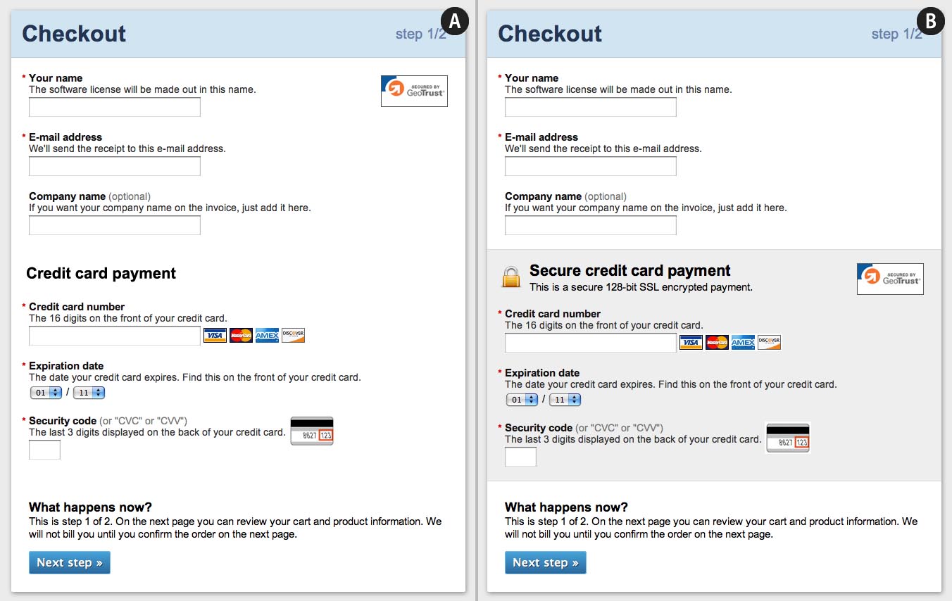
- Visual encapsulation of payment information blocks. To improve credence of your website related to such type of entered information as payment data, it also works to make the proper visual accents, such as visual encapsulation of payment-related fields. Actually, it only plays with the perception of information security, but it works better than not optimized forms.
- Implement a secure payment gateway. Withal, when designing your payment page you have to consider that most customers don’t have any technical understanding of web forms, PCI compliance or Secure Socket Layer (SSL). Instead, the customer will rely on his feeling and determine if your website seems secure or not.
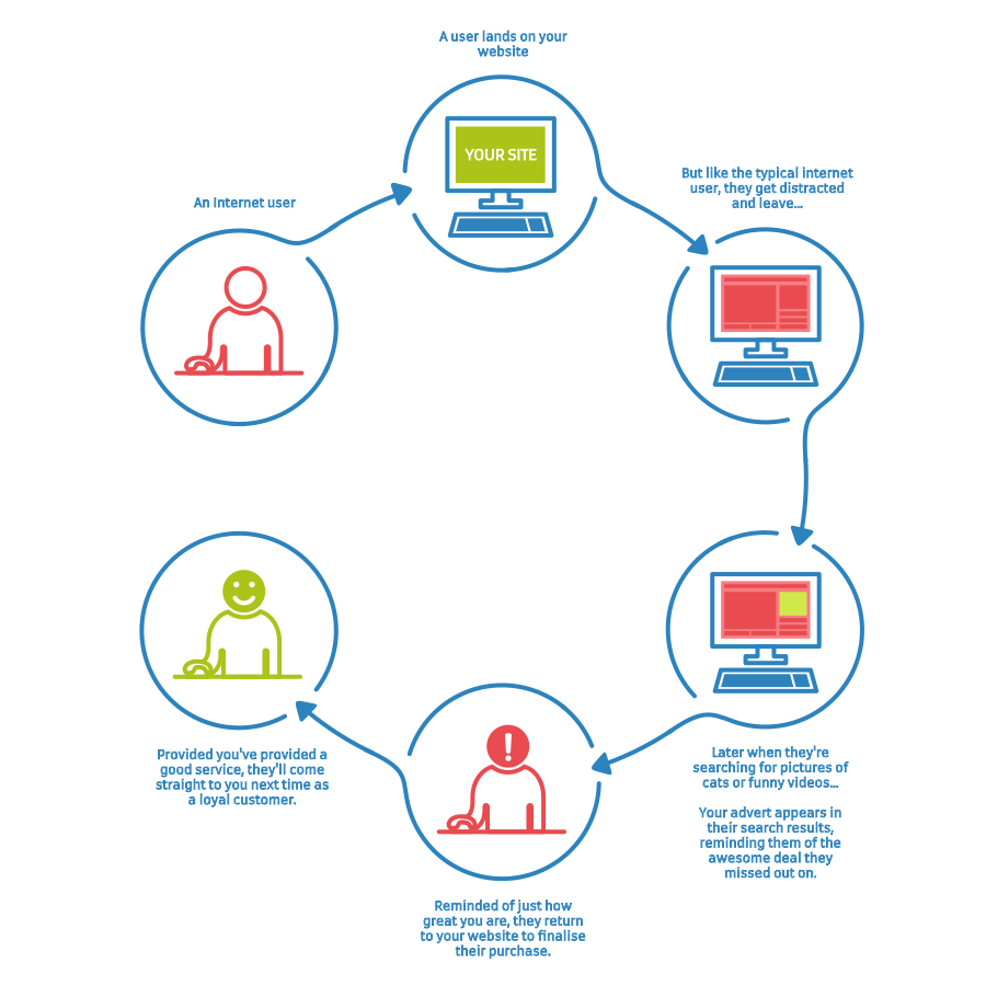
Don’t forget to bring back customers with retargeting
Another method of conversion optimization is remarketing (also known as retargeting). This wonderful marketing method allows transforming abandoned carts to one of the parts of a purchase funnel. There are different marketing instruments and channels allowing to use this method: social networks (Facebook, Twitter, LinkedIn), email marketing and contextual advertising (search, banner and video ads).
In conclusion, we want to draw your attention to the indispensability of using A/B testing and automatic conversion optimization (split-testing) for getting trusty results. Feel free to ask questions and sign up to our conversion optimization blog to be aware of the most actual information about conversion rate optimization.